


Use The Right Web Design Company!
Taking your business and putting it online is like finally getting your phone number in the phone book! Everyone depends on the internet for information, reviews, ideas, directions, YOU NAME IT! If you have a small business or are just starting out and want to finally get online, avoiding these 10 simple mistakes will give you a leg up!
1. Your Domain Name Is Too Hard To Remember.
When getting an online presence, you have to first come up with a domain name. For Example: facebook.com or youtube.com. This is what your customers will type into the browser. Having too difficult of a name will make it hard when telling others to visit your site. Pick something easy, but something creative to stay top of mind with your customers.
2. Have Too Many Styles In Your Website.
I know this from experience… There are 3 or 4 different websites that I like and I want to incorporate them all into one site. Sounds great, but in the end it leaves your visitors confused as to what style you are going for in the site. In some cases it may make your site look really uncoordinated! You don’t want your site to be giving you the wrong impressions, so take the time and come up with a good site plan and find out just what style you are going for.
3. Using Poor Quality Photos
Sometimes there are pictures we feel that we just have to have on the site. The important thing is to make sure the pictures don’t lower the quality of the site. We can build you a site with a ton of custom code and animations, but in the end, if we have very pixelated, grainy pictures, or even blurry photos, it can detract from the content of the site. Make sure you use high quality and high resolution photos so that your site looks crisp and modern across all screen sizes!
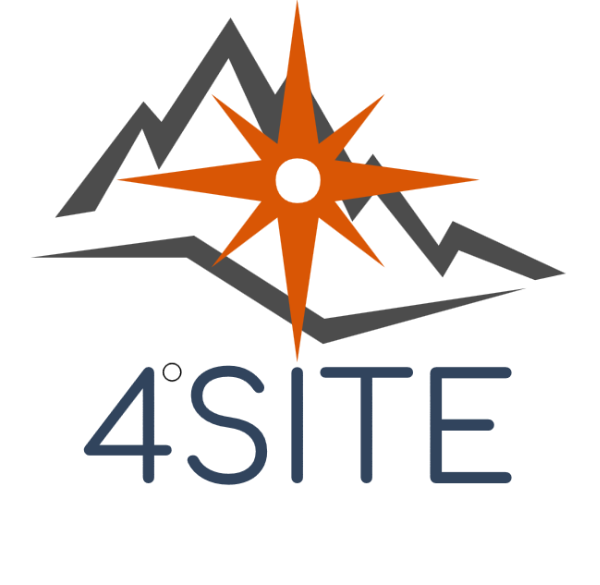
4. Using a Logo Without A Transparent Background
What do I mean by this? Take a look at the example below to get an idea.
Having a logo that doesn’t have a transparent background can really mess with the look of your website. When scrolling or if the logo goes over another color, the outline will be apparent, and will really be distracting. Having a logo that is correctly edited shows effort in site creation and makes the page really come together nicely.
5. Colors…. So. Many. Colors.
Sometimes we can get a little carried away with colors. If we get a site with too much going on, it can be overwhelming. A site built with a good color scheme is appealing to the eyes and will just flow from one point to the other as your customers view your site.
6. Getting A Host That Is Too Slow
You can purchase the wrong hosting plan for your site. Think for example if a HUGE WEBSITE like Facebook was put on a small server in china. If you are in the united states and attempting to view Facebook from the United States along with 3 Billion other people, you can imagine that site performance is going to be slow… Nothing loses your customers attention faster than having to wait.
Make sure you get a host that can keep up with your traffic! If you are not sure what kind of traffic to expect, hosts can be scaled up for performance, but may require a lot of work to move from one server to the next. However, GoDaddy makes this really simple, and with a couple clicks you can be migrated to a much faster server to handle all those visitors!
7. Working With A Website Designer That Won’t Give You Personal Numbers
I see this happen all too often…. A customer decides to work with a Website Designer and after a bit of time a product is delivered. The site may not work or look as expected so the customer goes to reach out to the Designer. They may pick up for a time, but after a while just stop answering. Or worse yet, you have a problem with your website, and you can’t reach your designer.
This can be for many reasons, but mostly, it is because there is a serious problem that the designer doesn’t know how to repair. That is why working with a team of both Website Design personnel & Engineers can ensure that no matter what problem has popped up, you can get it addressed and not be left in the dark.
8. Putting Too Much Information On The Site
People have EXTREMELY short attention spans. In fact, if you made it this far, that means you are truly interested. I’m glad this article is a good read!
Your customers want to go to your site and find what it is that they are looking for. They don’t have time to browse around to just see what you have on your site (unless they are at work). Making the information easily accessible will go a long way in making the sale, or getting the information to your customers.
Getting to the point quickly and with bold letters or using headers will ensure that Google also indexes your site correctly. Marking topics with H1 Headers will make sure that google knows what the topic of your site, page, or article is about.
9. Forgetting To Put Your Contact Information On Your Site
This seems obvious, but it happens all the time with new Website Design companies. You may think that putting your phone number on your contact page is good enough… WRONG. You have to put it on every page, because you never know when your customer is going to leave your site. That is why it is a good idea to put it in the menu somewhere.
You should also make the link something that interacts with their device. Today people are used to just clicking on the phone number and it automatically bringing up the phone application on their device and making the call. Same with Emails, Clicking the email link should automatically open the email application on their phone.
If your website design doesn’t do this, you need to address that situation quickly. Unless your customer really wants to get a hold of you, they are not going to get a piece of paper out to write down your information.
Kayla Sharp, owner of CakeSmith Desserts, did a really good job with this. She requested that we make a simple button at the top of her page that would automatically open a new email for her customers to contact her. Simple. Effective. Well done!
10. Not Knowing Where To Turn For Website Design
When getting a site up on the web, you have to know where to go for information. If you are doing this for the first time and want to work with a team that has experience designing and hosting sites, you are in the right place! We can help you with ever step of the process.
When coming up with your site layout, build your site in something that you are familiar with. Draw it out on a piece of paper, scan it, and send it to us! We can turn any design on any medium into a stunning and responsive website! We also make sure to educate our customers along the way. If you have a question we are here to help! Check out our Portfolio Page to get some ideas!
In fact, drop us a line here in the comments. What other mistakes have you seen on websites that you just can’t stand? Let us know!


0 Comments